 Back to News & Insights
The Engineering Behind Our Latest Hackathon: Building a Life Sciences Dashboard from Public Data
September 15, 2026 • Reading time 8 minutes
This is the Genomic Activity Dashboard, built over six weeks entirely from publicly available data. You can view it here: https://edgehealth.github.io/genomic-activity-dashboard/, or scroll to the end of the post to access directly.
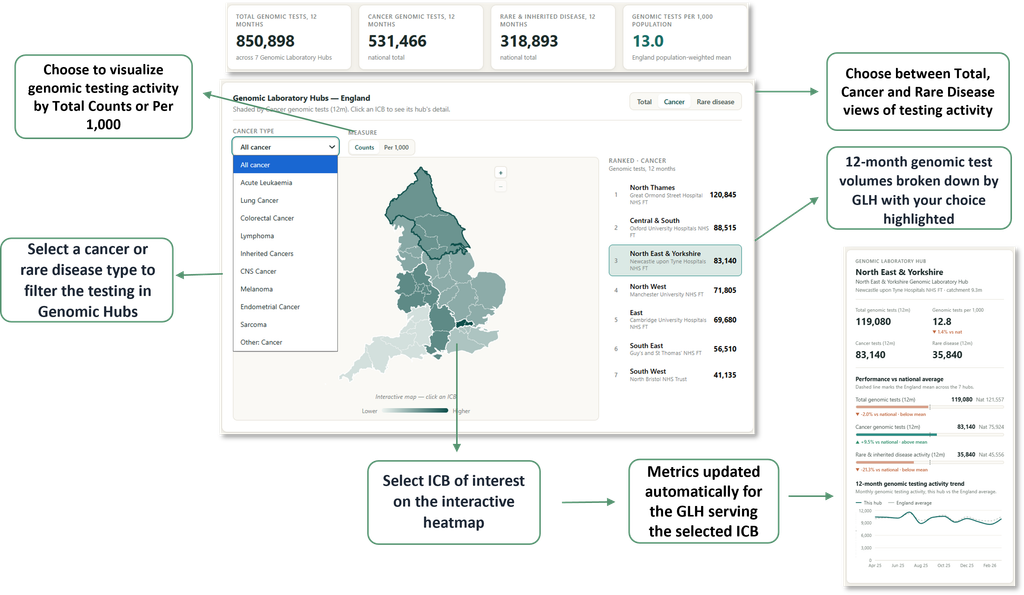
It brings together activity data on Genomic Laboratory Hubs in England, currently spread across different NHS and NDRS sources, into one place. It lets people see how genomic testing volumes vary by cancer or rare disease type across regions, how a single hub compares to national activity, and how different regions and hubs compare against each other.
We value insight and transparency as much as the output itself – so here’s exactly how the team built it, step by step.
How it Started
At Edge, we set aside time to explore challenges that sit outside our direct client projects, and where we can, build solutions for them. This year, for the second year running, we ran a data product hackathon where the team pitched their ideas for a product that would address a ‘gap in the market’, voted on them, and then fully built the winner.
The Idea
We work with public health data daily, and the more we see of it, the more we notice the gaps that stop analysts, commissioners and clinical teams from making the most of it. In some cases, the data exists but may be hard to use – it could be scattered across different sources that don’t talk to each other, published in formats that need cleaning before they can be used, visualised in hard-to-navigate ways, or a combination of all of the above.
We already had our Data, Analytics and Software Hub (DASH), solving parts of that problem in our everyday work. So, we ran a hackathon to point that same capability at something new, built around a gap we, and our clients, kept running into.
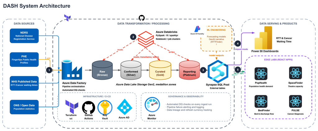
Our existing DASH platform ingests raw, unformatted data through pipelines in Data Factory, running automated DQ checks and Databricks notebooks bringing the data from its raw format to a curated reporting tier. In the SQL pool, view tables which sit on top of the curated data get read by our DASH API or Import modes feeding our Power BI or ReactJS Frontend applications.
The Vote
Week 0: We gave the team a brief – to brainstorm ideas for a data product that:
- Addresses a ‘gap in the market’ – an area where you feel there is some missing coverage
- Doesn’t exist already
- Could be created fully using DASH & publicly available data
We set aside time to brainstorm how the product would work to answer that gap, where good data exists but is not usable by the people who need it. We split into teams, and each team pitched a product built on DASH. Once everyone had presented, we voted as a group, and the Genomics Dashboard idea came out on top, with some very strong runners up (think: Earlier Cancer Diagnosis, Social Care Neighbourhood Spending, a landing platform for all of our experiments, and more).
The pitch? Bring together activity data on Genomic Laboratory Hubs in England, currently spread across different NHS and NDRS sources, into one place. The ‘Genomic Activity Dashboard’ would let people see how genomic testing volumes vary by cancer or rare disease type across regions, how a single hub compares to national activity, and how different regions and hubs compare against each other.
Building the Product
Our engineering team walked us through the plan for building the Genomic Dashboard, step by step – then we set off in teams to bring it to life.
Week 1: Extracting the data. The source data we used lives across NHS England and NDRS publications, in a mix of formats and refresh cycles. So we built a web scraper run through a Databricks notebook, to split multi tab workbooks into individual tables, landing everything in DASH in a consistent shape, with automated refresh schedules to ingest new data when it comes in.
Week 2: Mapping the data. The team built mapping files to connect the raw data to the metrics we wanted to report on. In April of 2026, England’s 42 Integrated Care Boards became 36; this meant the team needed a way to reconcile population and historic activity which was published against the old codes, to the new codes. A reference table we created carries both generations and GLH mapping, so rolling old ICBs up to current ICBs and on to Genomic Laboratory Hubs is one join:
Click to expand
icb_map AS (
    SELECT
        m.[Old ICB Code]  AS old_icb_code,   -- what the source data uses
        m.[ICB Code]      AS icb_code,       -- current (April 2026) ICB
        m.[GLH]           AS glh
    FROM [References].ICB_to_GLH AS m
)
Region names are matched on a canonical key, so the pipeline is tolerant of how each source spells them:
Click to expand
function normaliseRegion(region: string): string {
  return region
    .toLowerCase()
    .replace(/genomic laboratory hub/g, '')
    .replace(/\bglh\b/g, '')
    .replace(/&/g, 'and')
    .replace(/[^a-z]+/g, ' ')
    .trim()
}
Week 3: Defining the metrics. Working with our internal life sciences and genomics team, we built the metrics we thought were the most relevant as SQL views. In total, the team created 17 metrics to be fed into the dashboard. The SQL view is long-format: every metric (national counts, per-hub rates, cancer-type breakdowns, gene-level testing) returns the same nine columns.
metric_id · glh · icb · sub_category · gene
numerator · denominator · time_grain · time_period
The value itself isn’t stored. The frontend computes SUM(numerator) / SUM(denominator) over whatever the user has filtered to:
Click to expand
UNION ALL
-- gen_08  Genomic activity per cancer type - per GLH, monthly (count)
SELECT
    'gen_08',
    glh_key,
    NULL,
    activity_type,          -- cancer type
    NULL,
    SUM([value]),
    NULL,                   -- pure count, no denominator
    'month',
    EOMONTH([date])
FROM activity
WHERE glh_key <> 'National'
  AND activity_type IN ('Lung Cancer Activity', 'Sarcoma Activity', /* … */)
GROUP BY glh_key, activity_type, EOMONTH([date])
Rate metrics repeat their denominator on every row of a breakdown, so the view documents how it may and may not be aggregated:
gen_16 / gen_17 (ICB gene counts):
    denominator = the ICB's total for the year, repeated on every gene and
    every site row. Take it ONCE per ICB, never summed across genes or sites.
Week 4: Extending the platform. The engineering team extended our DASH API to the new metrics views using existing endpoints and authentications. In the app code, one interface describes a row of the view, so the shape is checked from the fetch all the way to the chart:
Click to expand
export interface GenomicsRow {
  metric_id: string
  glh: string | null
  icb: string | null
  sub_category: string | null
  gene: string | null
  numerator: number
  denominator: number | null
  time_grain: 'month' | 'year'
  /** Month-end (or year-end) date, as a Unix timestamp in ms (UTC). */
  time_period: number
}
Week 5: Building the front end. We then built the dashboard in React, querying the API directly, so filtering by hub, disease type, or comparison always reflects whatever the pipeline has most recently pulled in. In the interest of transparency and sharing our methods, we’ve kept this repository public https://github.com/edgehealth/genomic-activity-dashboard). The headline figures are national level metrics highlighting, over the past 12 months: total genomic tests, cancer & rare disease split of genomic tests, and the rate of total tests per 1,000 population.
For all of the metrics on the page, one resolver decides what a number means. One function decides what the region’s value is, and how to format it:
Click to expand
export interface ActiveMeasure {
  label: string
  longLabel: string
  format: (v: number) => string
  value: (hub: Hub) => number | null
}

export function resolveMeasure(view: MetricView): ActiveMeasure
The primary interactive element on the dashboard is an ICB/GLH level map, which updates the GLH level metrics and panel. The map is a plain SVG projection. Official ONS boundaries for the 36 ICBs are simplified offline with mapshaper, then projected linearly from lng/lat into the viewBox. Clicking an ICB selects it and its parent hub, so the panel can continue to work hub-level, with ICB level shading and reporting supported for future delivery:
onClick={() => onSelectIcb(props.icbCode, props.glhId)}
Week 6: QA. A final round of internal QA checked everything before releasing the final product publicly.
- every breakdown sums exactly to the headline figure above it
- shares total 100.00%
- all 36 ICB codes resolve to a known region
- summing a monthly series equals the 12-month figure computed independently
Tooling
| Layer | Choice |
| Ingestion | Databricks notebooks, scheduled refresh |
| Warehouse | DASH |
| Metrics | SQL views (long format) |
| API | DASH API, existing endpoints and auth |
| Frontend | React 19 + TypeScript, Vite, Recharts |
| Maps | ONS boundaries, mapshaper, hand-rolled SVG projection |
| Hosting | GitHub Pages via GitHub Actions |
| Tooling | JIRA, GitHub, Claude Code |
Why this matters
This project came together quickly because of the platform behind it, and the skills & appetite of the team building it. Our DASH foundations were already built with clear functions for pulling in data, cleaning it, the API, and hosting the front end. This meant the team could focus their time on the new parts, like handling the ingestion of the new data, mapping the regions, creating the metrics and building the frontend. It’s the same reason we can move quickly for clients: the foundations are already there, so the work goes into the problem itself.
You can view what we’ve created here in our newly provisioned Labs space: https://labs.edgehealth.co.uk/, along with the rest of the team-built experiments. To discuss what we could build through DASH for your team, contact me or the team!

Kate Cooper
Kate is a Consultant and Lead Product Engineer at Edge Health, building NHS data products from pipeline through to frontend. She leads engineering delivery on DASH-powered products including PULSE and Edge Labs. She holds an MA in International Relations with Quantitative Methods from the University of Edinburgh.

Temitope Sanni
Temitope is a Data Engineer at Edge Health, with a background in Data Science. He specializes in designing, building, and optimizing scalable data pipelines that enable more effective decision-making across healthcare and related sectors.