 Back to News & Insights
DASH: Automating Public NHS Data into Monthly Market Performance Insight
September 11, 2026 • Reading time 2 minutes
The Context
Recently, Edge Health worked with an independent provider of a large volume of independent sector activity for the NHS in England, delivering treatments across a network of private hospitals around the UK. Faced with a changing competitive landscape for referrals and treatments, the client wanted a clearer view of its performance in the market. Until Edge Health came in, this had been monitored using aggregated activity data, but with this data being published with a ~6 month delay, the client was left working from an outdated picture of how it was performing.
The Proposal
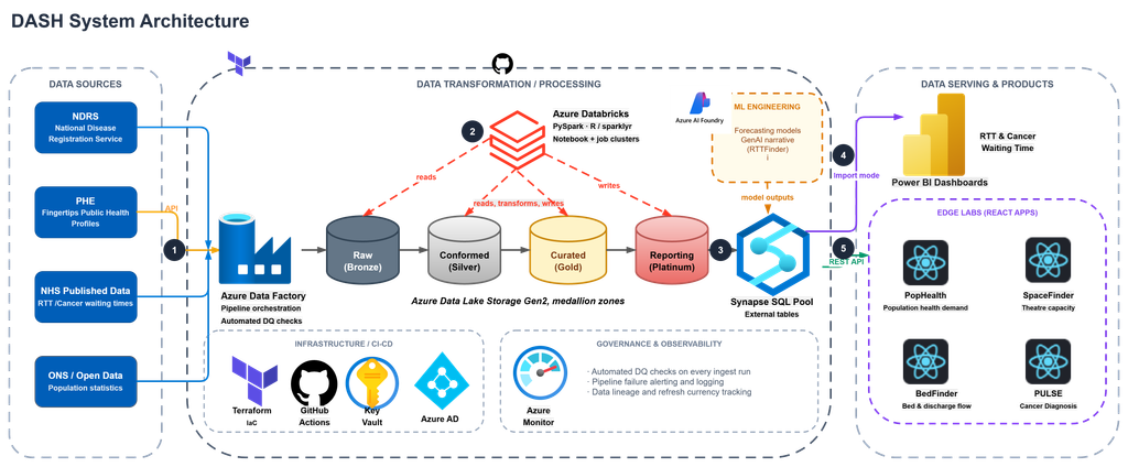
Edge Health’s engineers previously built DASH (Data, Analytics, and Software Hub), which lets our teams easily access and utilise publicly-available health data. Leveraging this expertise, we proposed building the client a Market Insight System dashboard, refreshing monthly, using NHS Referral to Treatment (RTT) data curated on DASH.
The Approach
To enable this, we built a data migration pipeline to push our DASH RTT data through to the client’s warehouse automatically each month. Each month, DASH scrapes the RTT consultant led wait times for new data drops from NHSE through pipelines built on Azure Data Factory. Once the data has been ingested, we run an automated DQ check pipeline which sends a summary of the quality to our internal engineering team – alerting us of any major changes to the structure of the data, missing reports, or other anomalies to be aware of.
We then use a Databricks notebook to bring the data from its raw version through to curated, where the data is in a format ready to build metrics off of. Finally, the data is surfaced in the client’s Fabric workspace through a OneLake shortcut, refreshed monthly by a scheduled orchestration notebook to land in the client’s Fabric workspace. On top of this data, we built the client’s Market Insight System dashboard in PowerBI. Working closely with the client throughout via workshops, user interviews, and weekly steering group meetings, we designed the dashboard around an experience that would be most useful for their team.
The Solution
The dashboard spans four pages: an Executive Summary tracking referrals and market share over 3, 6 or 12 months; Trends for longitudinal comparison against the NHS and wider independent provider market; a Performance Matrix breaking those metrics down by ICB geography and provider; and a Methodology page showing how each metric was calculated.
The Impact
Armed with a view of their own market performance, the client’s team can now base important decisions from a single source of truth, refreshed automatically. The client can see shifts in referrals and market share as they emerge, identifying the areas where their share is slipping and acting early, while spotting the geographies and providers where they are performing strongly. That makes it possible to celebrate success where it is happening, look to their best-performing sites for examples of best practice, and share what works across the wider network.
To discuss what we can build with DASH for your organisation, contact the team.

Jonathan Bruce
Jon is a Director at Edge Health, an experienced health economist and modelling expert. Jon specialises in the application of economic and statistical modelling techniques to improve decision-making and drive operational improvements.

Kate Cooper
Kate is a Consultant and Lead Product Engineer at Edge Health, building NHS data products from pipeline through to frontend. She leads engineering delivery on DASH-powered products including PULSE and Edge Labs. She holds an MA in International Relations with Quantitative Methods from the University of Edinburgh.